Why does your business need a mobile-friendly website?
Recent marketing research has shown that more and more consumers are using mobile devices to find information on local businesses. One such study by the Local Search Association shows that mobile phones and smartphone use in search increased from 25% in 2012 to 34% in 2013 and 42% in 2014.
These industry statistics are supported by the website visitor reports for our clients as well. When we look at their Google Analytics reports, it is evident that there is an increasing percentage of website visits coming from mobile devices compared to previous years. Below is one such report, where mobile devices make up over 25% of visits to their website in 2015 compared to less than 10% for the same period in 2014. It is worth pointing out that this home contracting client switched to a mobile-friendly website at the beginning of 2014.
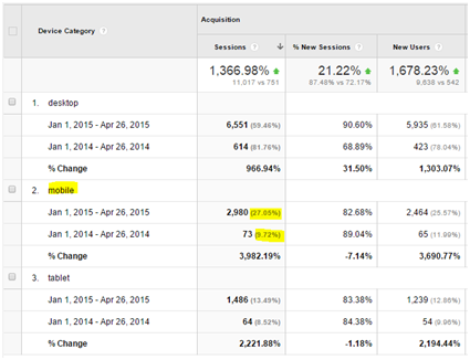
The Google Analytics for one of our home contractor clients show that mobile devices make up over 25% of visits to their website in 2015 compared to less than 10% for the same period in 2014.
In addition to more consumers using their smartphones to visit websites, recent Google algorithm changes made having a mobile-friendly website even more compelling. This recent change will "boost the ranking of mobile-friendly pages on mobile search results". Switching to a mobile-friendly website does not mean that your business will automatically improve your search engine ranking results, but it does mean that if your competitors don’t have mobile-friendly sites, it is an opportunity for your business to show up on mobile search results.
3 ways to check if your website is mobile-friendly
-
Look at the website on your smartphone. You want to make sure the text is readable on each of your pages without the need to zoom in to enlarge the content. You also want to make sure that the menu navigation and call-to-action buttons are far enough apart for adult fingers to click on.
-
If you’re on your desktop computer, you can check if a website is mobile-friendly by simply resizing your browser window and making it smaller. The elements of the page will typically move as you make the browser window smaller and narrow to match the size of a smartphone
 When you resize your browser window, the elements of a mobile-friendly web page will move around and the text will resize itself as you change the size of the window to the size of a smartphone
 -
Go to Google’s Mobile-Friendly Test at https://www.google.com/webmasters/tools/mobile-friendly/ and enter your webpage’s URL. You will immediately find out if Google sees the page as mobile-friendly or not. Remember though that this tool only tests the specific page. To check the mobile-friendliness of your entire website, you should log into your Google Webmaster Tools account.
How to you make your website be mobile-friendly
For websites that do not currently pass the mobile-friendly test, the good news is you don’t have to spend a lot of money or change your entire website to make it be mobile-friendly. There are many approaches to having a mobile-friendly website, but Google’s recommended option is to have a responsive site.
If you are familiar with HTML and CSS, here is Google’s guide to making a website responsive. For the less technical, contact us and we can convert your current website into a mobile-friendly and responsive site - as long as your web platform allows it. We can also make some recommendations on how to improve your website’s visibility on search engine results.
Email us today at [email protected] if you need help making your current business website mobile-friendly.
